My free 6-week subscription to the daily Register expired last week. So I have to resort to using DesMoinesRegister.com or reading the paper at the coffee shop (or catching snippets from State 29, with usually-good commentary).
Nonetheless, using DesMoinesRegister.com pains me. Let me explain.
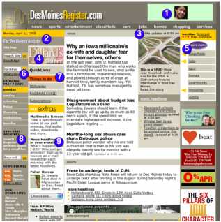
- WTF? What is this ad? Why is this woman’s face staring at me? Get better online ads.
- Yeah, we know that this is “The Des Moines Register”. Do we need two mastheads?
- I’m glad the site was updated recently, but what was updated? I want to see the updated content.
- Why on earth would I “Click here”. I hope Dillard’s didn’t pay any money for this web campaign
- We don’t need two navigations to get to classified ads. There is already a link at the top.
- A good tip is that if you have to put “What’s this?” beneath something to explain the “QwikNav” then you probably shouldn’t have it on the site.
- Why is this orange?? I’m not on the “Things to do” page. Don’t hi-lite the link in orange to draw attension to it. The link is alread bolded – that should be enough to emphasize it.
- Why can’t the search the archives and search the site be combined? How many search boxes do you need on the page?
- Put this with the RSS. Email newsletters are just another method of keeping up-to-date on the site. It’s similar to RSS.
Some general things to work on. Clean it up a little. You don’t need to break up the page so much; there’s news, daily navigation, quick links, top navigation, classified navigation, web extras, more headlines and the ads — that’s too many boxes for the average user to try to find something. Get rid of the stupid animated GIF ads, they annoy readers. Make it so I can find stories I read in the paper. Last week I read the blurb about the Pulitzers and couldn’t find anything on the website resembling the piece I read in the paper.
The redesign is an improvement from the last design. But it could be much cleaner and the page needs some room to breathe. With all that drab brown-grey background you need to reduce the information density.
I’m sure I’ll read DesMoinesRegister.com cause I have to, but I’ll get most of my news from Google, Memeoramdum, and washingtonpost.com.
2 Trackbacks/Pingbacks
Mikey,
Are you ever right! The UI on thier site is brutal.
[…] I don’t know when they changed the site. I commented on DesMoinesRegister.com in the past so I’ll offer my thoughts again. For once, I’m impressed by som […]
Post a Comment