Looks like DesMoinesRegister.com has gone through another iteration of redesign. I primarily get my news via RSS these days, so I don’t know when they changed the site. I commented on DesMoinesRegister.com in the past so I’ll offer my thoughts again.
For once, I’m impressed by some of what they’ve done. First, the speed with which they did some tweaks to the site, (it took them years to get to the grey-brown background they introduced last spring). And second, they finally lightened up the web pages a little (they were too dark before).
Nonetheless, there are still problem spots.
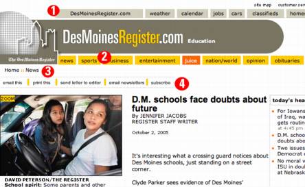
- The whole top navigation is floating in the white-air too much. They need to anchor it to the browser or add some lines so I don’t feel like all these buttons would float into each other with a strong wind.
- Using the white space of the background of the page to divide these menus doesn’t work. And the cool effect of sliding menus is overkill. People want to read news, not be impressed by animation tricks.
- I’m glad they are putting cookie crumbs on pages; this helps the reader know where they are. But this too needs some lines around it to anchor it on the page.
- This list of options needs to be trimmed down and moved elsewhere on the page. Remove “send letter to editor” – I’m not going to write your stupid editor, I’m going to blog about it. Remove “email newsletters” – nobody reads junk email anymore. Remove “subscribe” – I’m reading it free on the web, I’m not going to subscribe
Post a Comment